Colour with Confidence

One of the most common questions I’m asked as an interior designer is how to work with colour. Which colours work together? How many walls should have a feature colour? How many colours should you use? The truth is there aren’t any hard and fast rules however there are design principles and an understanding of the human psyche that can help guide us. By understanding colour as a tool you can use it with intent and change the way you feel in your home. So lets break it down into some chunk sized colour blocks for you.
Because colour can elicit moods and feelings it can also help define the mood of your home. Colour is well known among interior designers for its ability to evoke emotions, also referred to as colour psychology. Some examples include blue for calm and sophistication, green for renewal and pinks for nurturing. Colours can help you feel embraced within a room or allow for it to blend into its surrounding area and feel expansive. They can feel dark and cosy or light and airy.
Colour and the way we feel in our spaces has become such a focus that Google were imbued with the task of creating an installation at Milan 2019 assessing how people feel in response to design. After all if we can understand how to manipulate the way we feel with design we can give more people happiness ultimately adjusting the world around us.
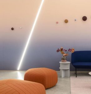
A selection of secondary colours from different zones of the colour wheel result in a high energy space. Cocktails and Jazz anyone? Google Milan 2019 “A space for being” Image via @google
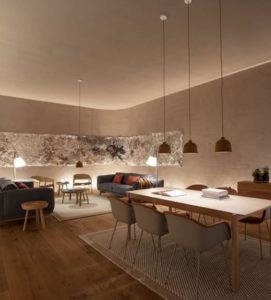
Low lighting, warm tones, timber and natural stone create an embracing style.
Google Milan 2019 “A space for being” Image via @google
Hard reflective surfaces with an overall palette of grey can feel cold and uncomfortable.
Google Milan 2019 “A space for being” Image via @google
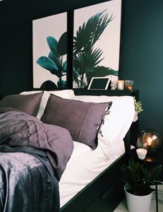
Consider the following bedrooms. A bedroom with rich deep green walls creates a distinct feeling of an adults abode, exclusive and luxurious. You could absolutely consider painting all of your walls in a situation like this. And don’t forget wallpapering as an option to give additional depth and texture. On the other hand this white bedroom is crisp, fresh and welcoming. It looks like the kind of space you would fling the doors open and let the kids jump in.
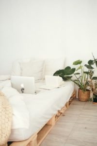
For a similar colour try Dulux Paua Shell
Now if you’ve already popped over to the paint store and looked at colours you will know that it is an endless rainbow of options. So what if you can’t choose? Here are three easy ways to narrow your choices.

Look at the historical attributes of your home or existing colours that will not change such as brickwork or a feature tile. You might have unmoveable issues. If you want to stay true to the era of the house you may immediately be channeled down a road. Easy. Is there a splash back tile that you are keeping and love? Great. Maybe it is a good starting point. Or if the exterior of your house will not change consider how it can influence the colours within.
Furniture colours reference this north brisbane 1970’s home. A basic coloured pattern on the rug adds playfulness and prevents the space from feeling like a thoroughfare. Rug- Armadillo & Co; Large Ottoman- West Elm; Armchairs and Sofa- Freedom
 Try starting with a hero piece. If you have a piece of art, a cushion or a photo that you love chances are you love the colour palette also. Use the colours to inspire the selections in your home. You only need to find one colour to make a start. In this board the colours all connect back to the artwork however they also connected with the terracotta tiles of the home the board was created for.
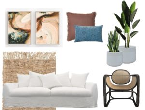
Rug- Armadillo & Co;
Chair & Sofa- MRD Home; Art- Etsy; Pots- Bunnings; Cushions Eadie Lifestyle & Adairs.

Look outside your window and take a cue from nature. After all nature knows how to get it just right. Sunset colours, the ocean and the sand, gum leaves and their silvery trunks. The added benefits of looking to nature for inspiration is that you can immediately connect with where you are.
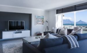
The blue of the room references the ocean and mountains beyond immediately connecting the spaces and creating a seamless experience.
Remember to consider the temperature of your colour palette. What is the temperature? This is the visual temperature of your colour palette. Colours in the blue, green and purple are referred to as cool while colours in the red, orange and yellow zones are referred to as warm. While an all cool colour palette may work for some people for others it certainly will not. The room with the ocean view above is beautiful however for me I would much prefer to see some warm tones added such as a seagrass basket or some brass ornaments.
Once you have some ideas, set a colour palette and aim to stick to it. You might drift in some areas however your rooms and pieces should aim to speak to each other. For example, using the colour palette below I would potentially use these colours throughout most of the home but amp up the pink in my daughters room. Or I might go a shade darker on the pale blue for a rug. Don’t be hamstrung by your palette but let it guide you.

Deciding where to add your colour is just as important as what colours to add. Of course there are the accessories, but when it comes to walls and tiles there is greater uncertainty and of course concern regarding effort and financial risk. You may remember a period where people starting adding a feature wall into every room they could because that’s what everyone thought was “the thing to do”. However adding a coloured wall for the sake of it does not truly do your home justice. And of course how much is enough? To be honest the amount of colour to be applied can be quite dependent on you. Some people love the idea of a world full of colour and that’s great. It’s your home and you have to love it. However before you get to creating your rainbow house, first consider what you want to achieve.
 Colour in your home can be likened to applying make up. Neutrals are applied as a foundation colour while the tints and shades of accent colours are used to highlight and bring attention to beautiful aspects. For example, in this image the chair is such a bright colour it immediately draws your eye even though it is a very small proportion of the image. You can see how a bright colour may be used as a focal point to draw attention.
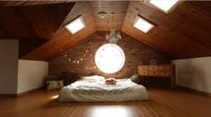 In this room, everything is the same warm tone creating a feeling of comfort except the bed which is bathed in light creating an event of the bed.
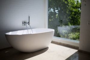 Meanwhile this all white bathroom allows the view to come into focus. Imagine how the view would have had to compete if a turquoise tile had been used.
Look at your home as an empty lined drawing and think about where highlights might improve a feature or hide one. Perhaps you would like to highlight one space within a room like a study nook. Even though the nook is small by applying a highlight it can appear to have greater bearing in the room.
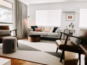
 A winding stair rail is graceful so why not accentuate it with an accent colour. You can also use colour to obscure or refocus attention from less pleasant areas. For example using a bold colour in one location might draw attention away from something less appealing. Use colours to connect one space to another or to define it as a separate space. A feature wall can be completely useful if you want to draw someone into a room, highlight the walls importance or balance a large space out. In this living room the soft grey wall balances out the white and gives the living room a slightly more relaxed cosy feeling as opposed to if it had have been left all white. For similar colours try Dulux Lexicon Qtr with Dulux Silver Twilight
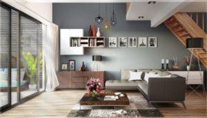
The feature wall here grounds the living room as a zone and relaxes the feeling while drawing the eye to the outdoor wall on the left .
To maintain balance and movement in your space repeat the colour throughout. It may only be in a vase, cushions and art but it will give cohesion. And add a little pop of your accent colour at the front door if possible. Whether it’s in a coat rack, a pot or an entire door, hint to your guests what to expect inside and they will love the unfolding reveal. I do hope that this article has given you some confidence around colour. If you need further advice on whites go to my article and don’t forget to subscribe for tips on creating your home. Until next time xo Bec